Fed swap lines during the 2020 global pandemic
The Federal Reserve USD swap use was comparable to 2008-09; this time Japan benefitted most, while some euroarea countries accessed more than others
During the pandemic, the Federal Reserve once again moved swiftly to calm dollar funding markets by extending swap lines to select central banks—alleviating currency pressure that would otherwise emerge. While the peak value of swaps outstanding was smaller than in 2008-09, the 2-month change was comparable to that during the Lehman shock. And as then, Fed funding was more rapid and substantially larger than IMF net resource provision. We provide a definitive ranking of swap access by breaking out National Central Banks from the ECB aggregate. While BOJ access was greatest in percent of GDP, Luxembourg was not far behind.
Amongst the exceptional policy actions taken by the Federal Reserve as coronavirus pandemic risks emerged last March, the extension of swap lines to 14 central banks—from the 5 with pre-existing arrangements—was once again crucial for stabilising the international monetary system. Roughly, with some nuances across central banks, from the second half of March, 7-day USD swaps were offered daily and 84-day swaps weekly until these facilities were voluntarily scaled back over the summer. At its peak, this resulted in the provision of USD449 billion in dollar liquidity on 27th May from effectively zero on 18th March.
How did access compare with 2008-09? Who took advantage of these swaps? And how were they put to use?
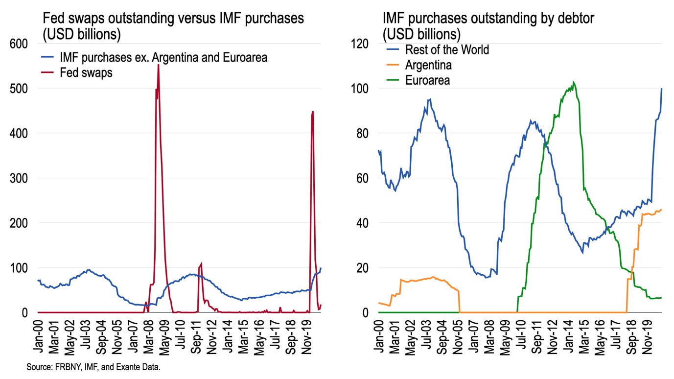
Fed swap lines were first extended in their modern incarnation during the 2008-09 crisis when, peaking in Dec. 2008, they reached USD554 billion using end-month data (i.e., USD106 billion more than May last year.) The change over two months in swap access during March (USD206 billion) and April (USD233 billion) last year totalled USD439 billion; this was comparable to the change during Sept. (USD75 billion) and Oct. (USD357 billion) of 2008 which equalled USD432 billion. Seen in these terms, Federal Reserve swaps provided support during the COVID-19 panic was comparable to that during the Lehman shock in 2008.
The chart above compares these Fed swaps to outstanding IMF purchases, measured in USD, over the past 20 years. On the left, IMF purchases removes the idiosyncratic cases of Argentina and the euroarea, reported on the right, to give a sense of the relative scale of Fed swaps compared to other “normal” demand.
Total IMF purchases outstanding (ex. ARS and EUR) reached exactly USD100 billion in December, slightly above the prior peaks in 2003 and 2011. The cyclical draw on the Fund coincides with demand for Fed swaps, of course. But the speed and scale of drawings on the Fed—and corresponding repayment—greatly exceeds those making “purchases” on the IMF. Roughly speaking, total access to the Fed peaks at 4-5 times the total stock of IMF purchases, and is much larger in change space. Fed swaps are rapidly repaid, Fund access ramps up only slowly.
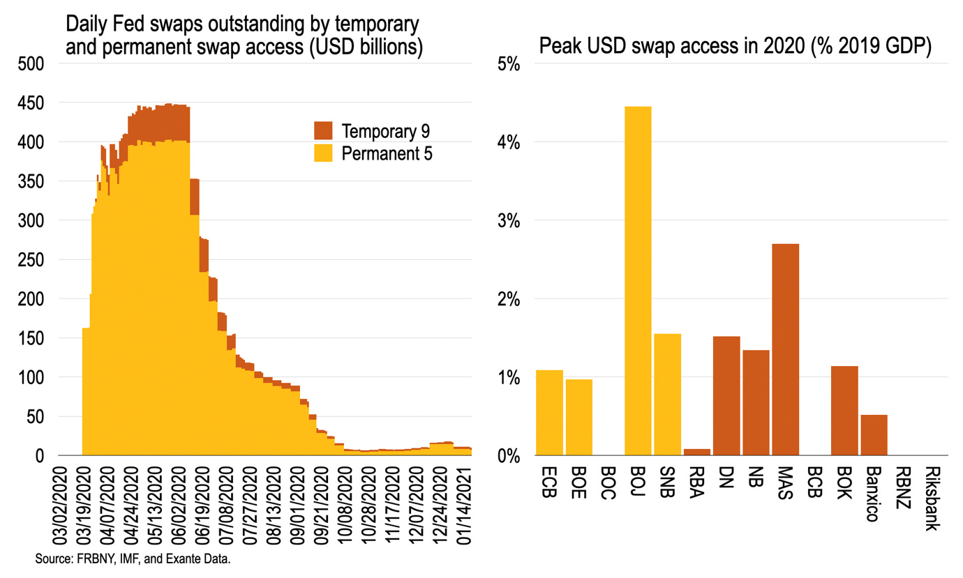
The next chart decomposes the Fed swaps into daily access by the Permanent 5 (P5) central banks (ECB, BOE, BOC, BOJ, and SNB) and the Temporary 9 (T9; RBA, DB, NB, MAS, BCB, BOK, Banxico, RBNZ, and Riksbank) since early March. Access plateaued just below USD450 billion throughout May and the first week of June. From June 10th repayment of 84-day swaps from March began, the storm had passed, after which total swaps outstanding then fell gradually, falling below USD100 billion by 6th August and below USD10 billion by early October.
To put T9 swaps in context, peak access by these central banks alone in 2020 was USD47.3 billion. This compares with USD46.6 billion in net IMF purchases throughout the year at the December SDR rate (i.e., removing the valuation adjustment on the prior-stock). So, the Fed provided more liquidity to these select central banks than demand for IMF resources in 2020.
Median peak access amongst the 14 central banks was exactly 1 percent of GDP, though some central banks did not initiate access at all (BOC, BCB, RBNZ, and Riksbank) or in only small amounts (RBA) while BOJ saw access peak at 4.4 percent of GDP (USD226 billion.) In Europe, ECB and BOE peak access at around 1 percent of GDP was comparable with BOK and slightly below the SNB’s 1.5 percent.
Swap access was granted to the same 14 central banks as in 2008. As then, 10 central banks made use of the swap facilities last year. Three central banks both then and now didn’t access swaps—BOC, BCB and RBNZ. Riksbank didn’t draw on USD funding in 2020 but did in 2008; MAS drew on funding last year, but not in 2008.
Arguably, 4 additional central banks were able to access these USD swaps last year due to the expansion of the euroarea, with ECB acting as conduit. Slovakia only joined the euro in 2009, too late to receive USD funding at the height of the Lehman crisis; the Baltic states, denied EUR swaps in 2008, all joined after 2010 and had access to USD funding last year.
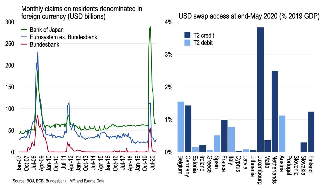
The next chart compares BOJ, ECB, and Bundesbank foreign currency claims on residents, converted to USD, to illustrate the balance sheet impact from the other side of the transaction. Debtor central banks have dollar liabilities to the Fed which they intermediate to local banks, so this shows up as an FX claim on residents. Whereas BOJ access in 2008-09 was smaller than the euroarea, last year it was larger.
In addition, using ECB data on National Central Bank (NCB) balance sheets, which were not reported back in 2008-09, we can estimate the distribution of USD claims across the Eurosystem as of end-May (roughly when ECB access peaked). On average, countries with TARGET2 credits (such as Germany, Netherlands, Luxembourg) drew proportionately more on USD swaps than T2 debtors (in percent of GDP). There is some irony here. Those who complain most about carrying euro claims on the Eurosystem due to apparently weaker NCBs are themselves most reliant on Fed support during times of stress. And they de facto lean on the support of those “weaker” periphery balance sheets through the Eurosystem which shares the liability to the Fed.
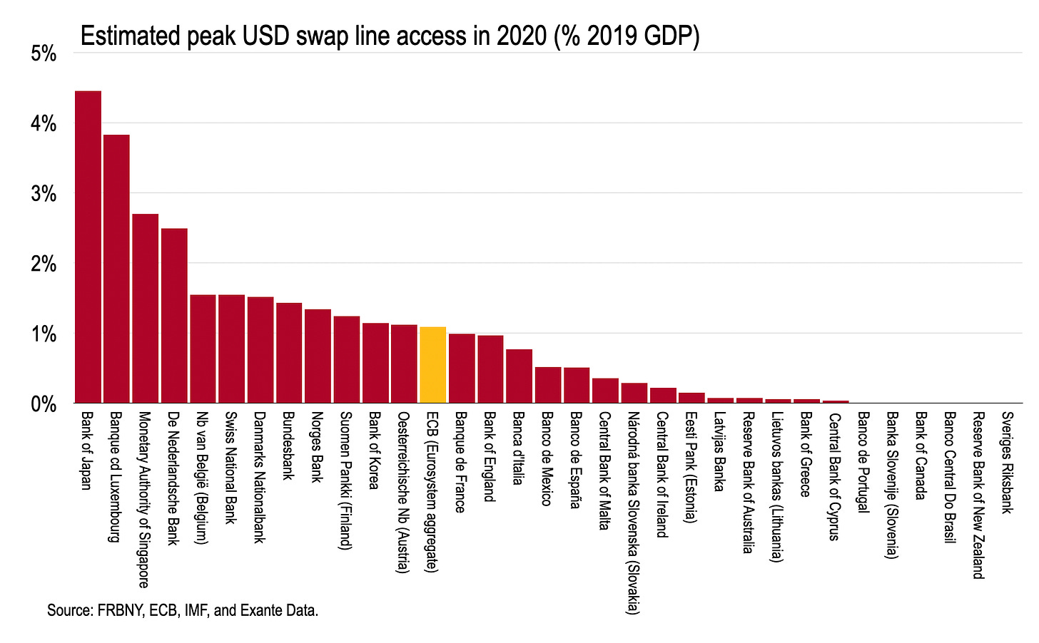
As a result, we can offer a definitive ranking of central bank access to USD swaps in 2020 in percent of GDP, as below. The top five central banks by residence were Japan (4.4 percent), Luxembourg (3.8 percent), Singapore (2.7 percent), Netherlands (2.5 percent) and Belgium/Switzerland (1.6 percent).
Much like the Bank of England during the height of the classical gold standard, the Fed acts as fulcrum of the international monetary system—and by flexing its balance sheet during times of stress, the Fed is able to control global liquidity and funding conditions to the benefit of the United States and the system as a whole. During the pandemic, as in 2008-09, the Fed once more substituted for the IMF in providing rapid short-term credit during a period of global balance of payments stress, pushing the Fund further towards a peripheral liquidity provider when it matters most.
END.


